Red Fox
A Foxier Approach
To Real Estate.
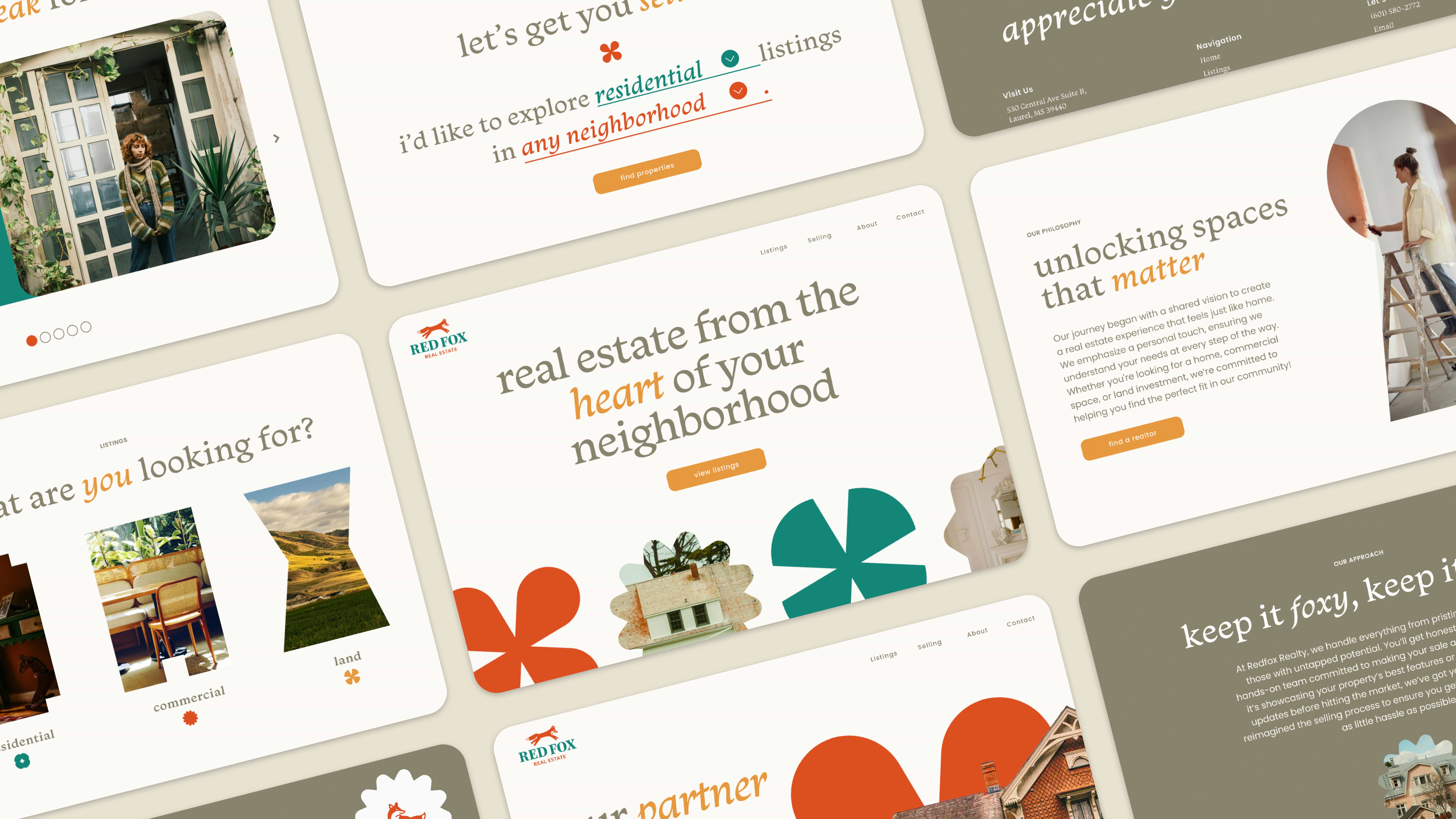
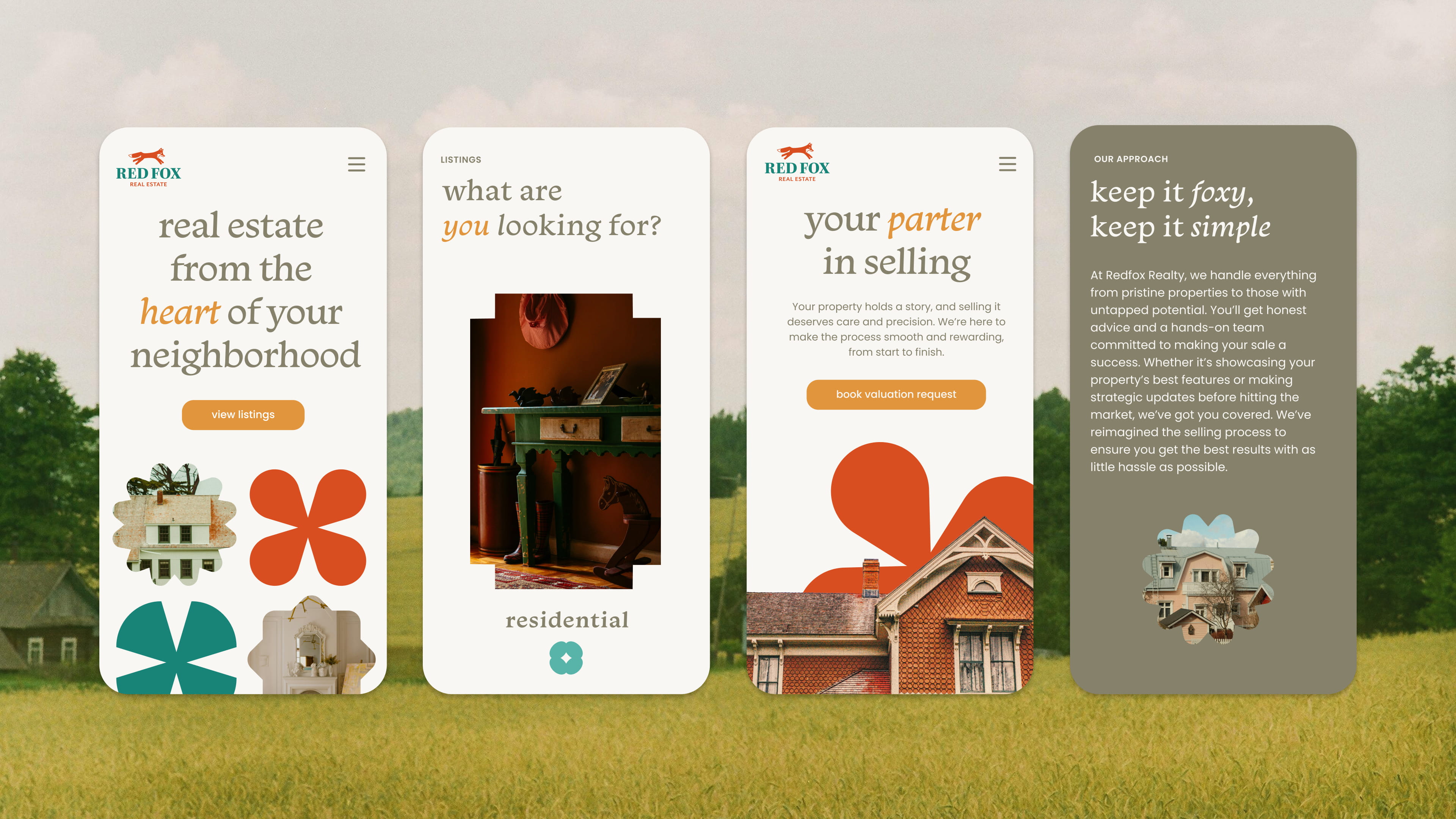
Red Fox is a real estate website redesign for a local agency in Laurel, Mississippi. The original site lacked a clear brand presence, feeling outdated and underdeveloped. This redesign introduces a stronger visual identity while preserving the warmth and small-town charm of the agency. It creates a more cohesive, trustworthy experience tailored to an audience of primarily older homeowners.
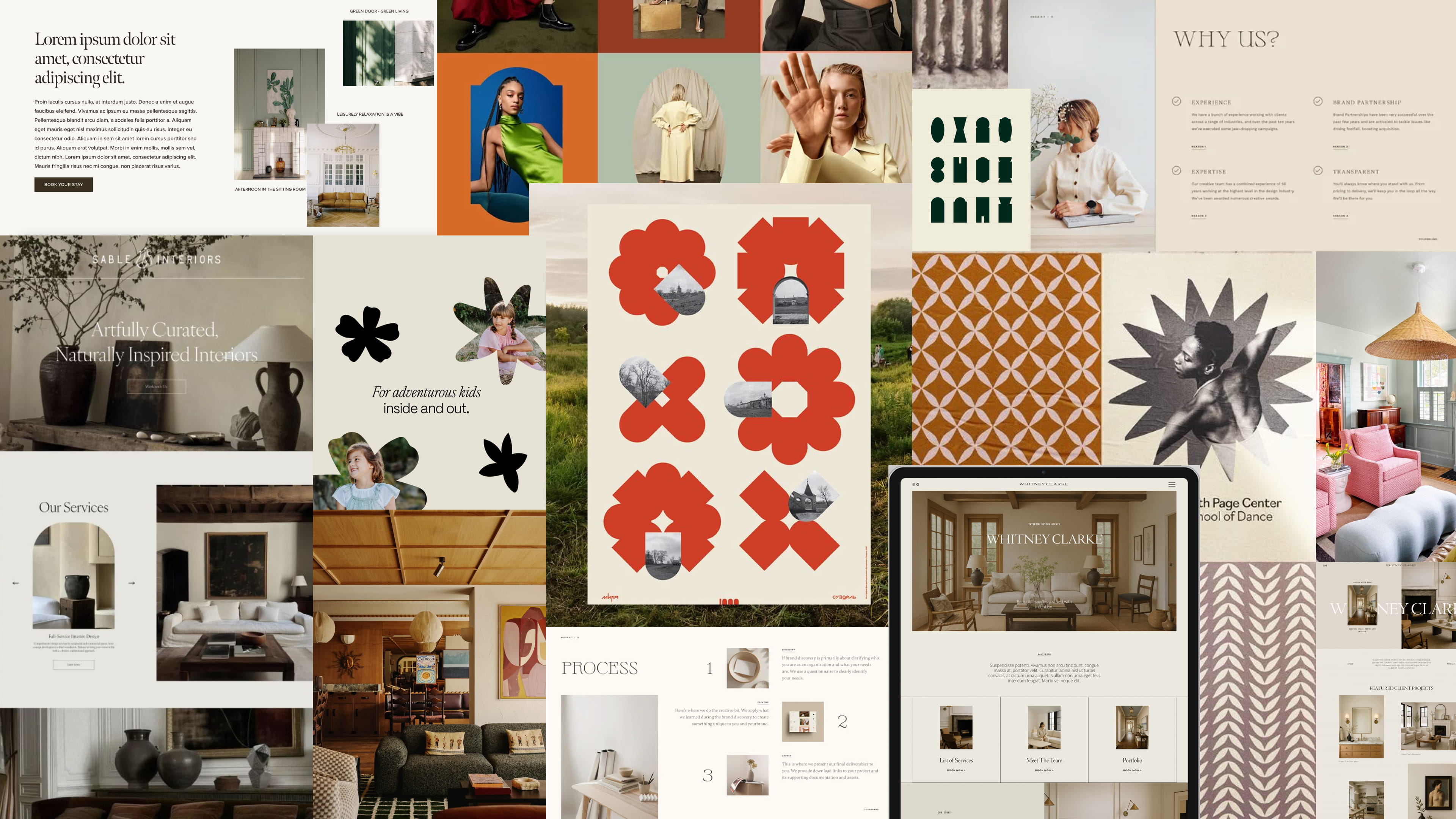
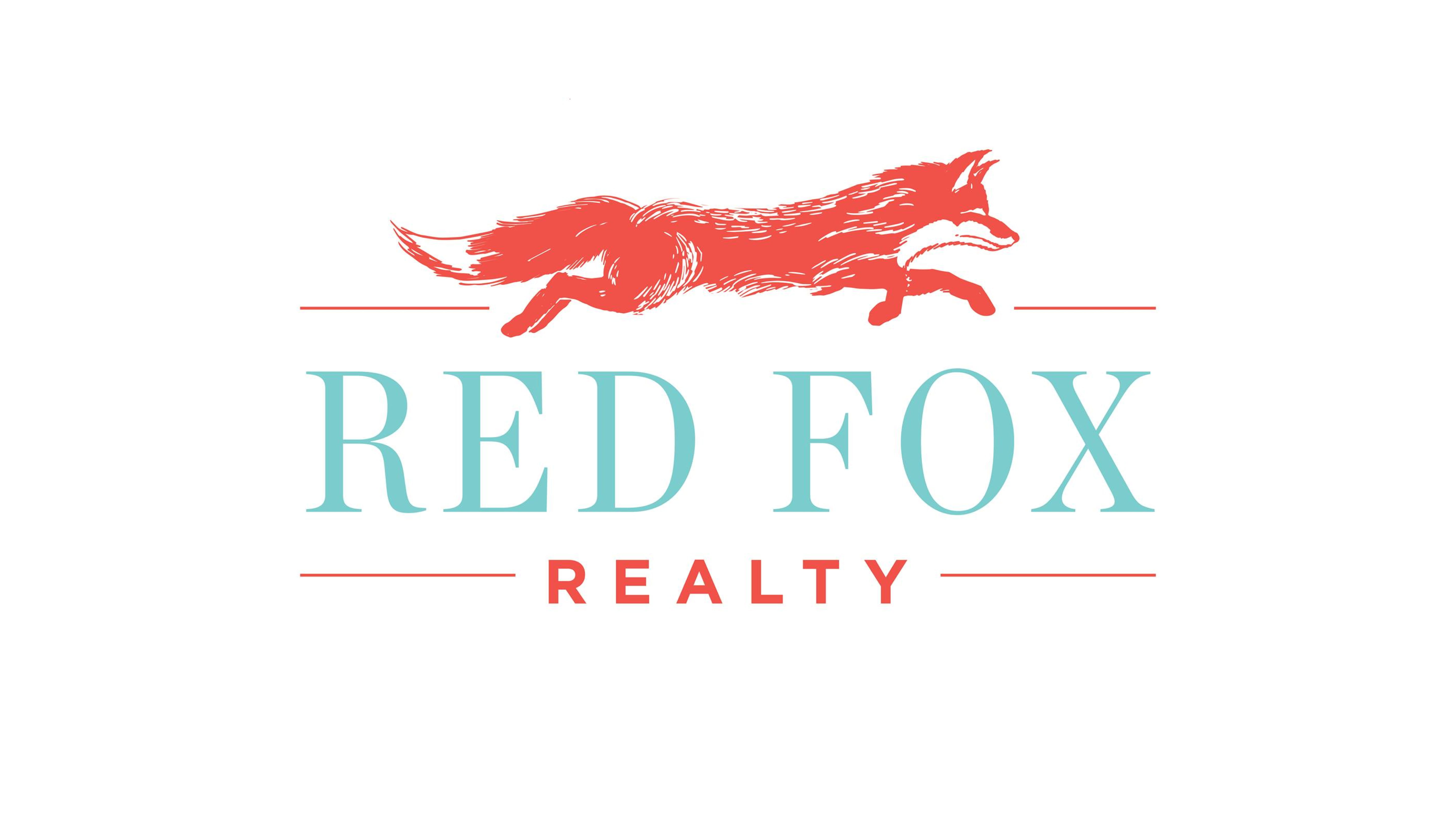
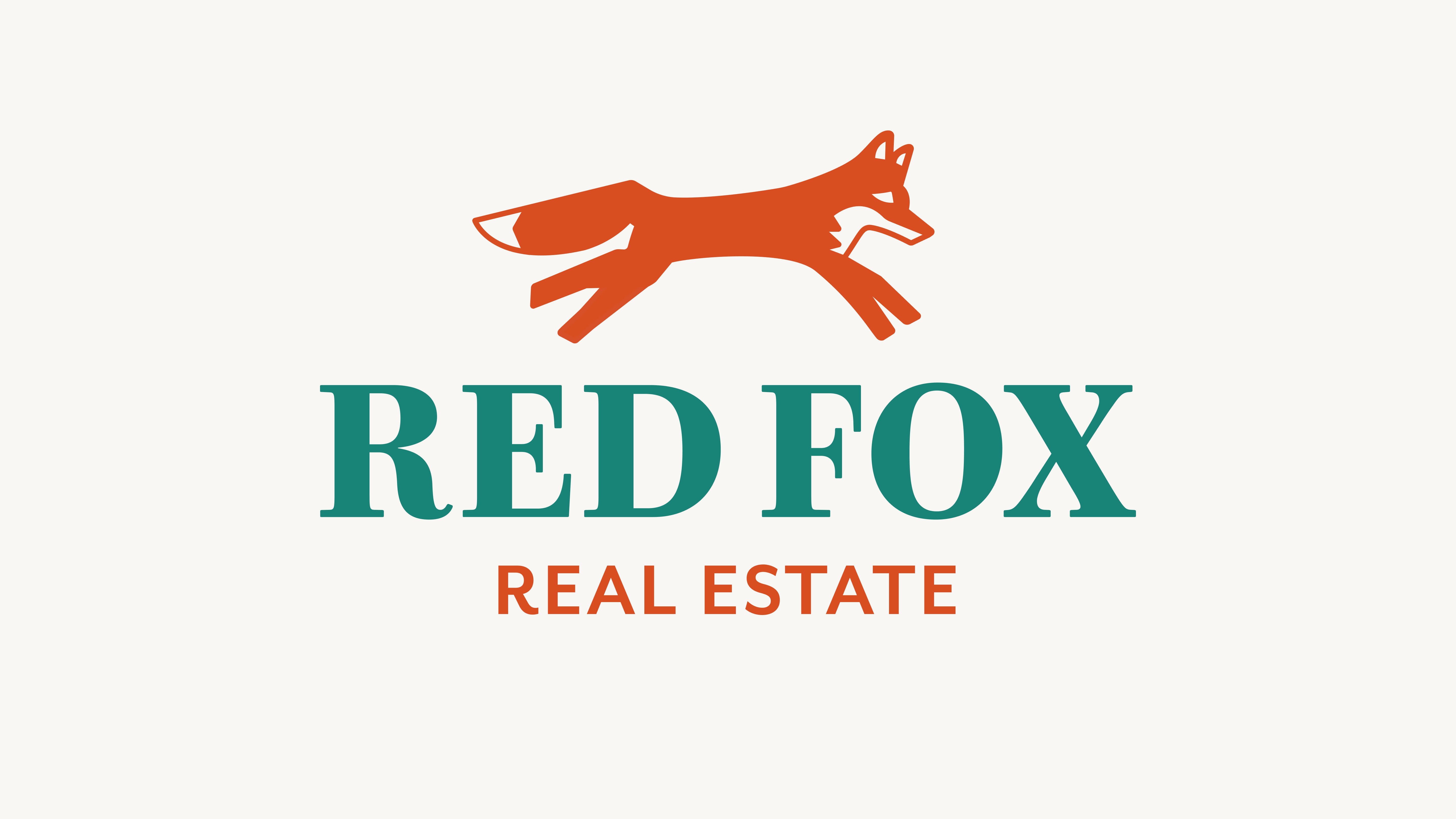
Red Fox’s branding captures a small-town charm through the use of serif typography and a warm, grounded color palette. The redesign preserves the agency’s recognizable logo while refreshing it with a new typeface and a simplified fox icon, improving its versatility. The visual system leans into organic geometric shapes to create a sense of softness, supported by messaging that feels personal, inviting, and lightly playful through subtle fox-inspired wordplay.
Brand Identity
Logo Design
Website Design
Charming
Trustworthy
Easygoing
Monarcha
Poppins
Student Project
Fall 2024
The process focused on adding personality to the website while maintaining its mature, small-town charm for an audience of older homeowners.
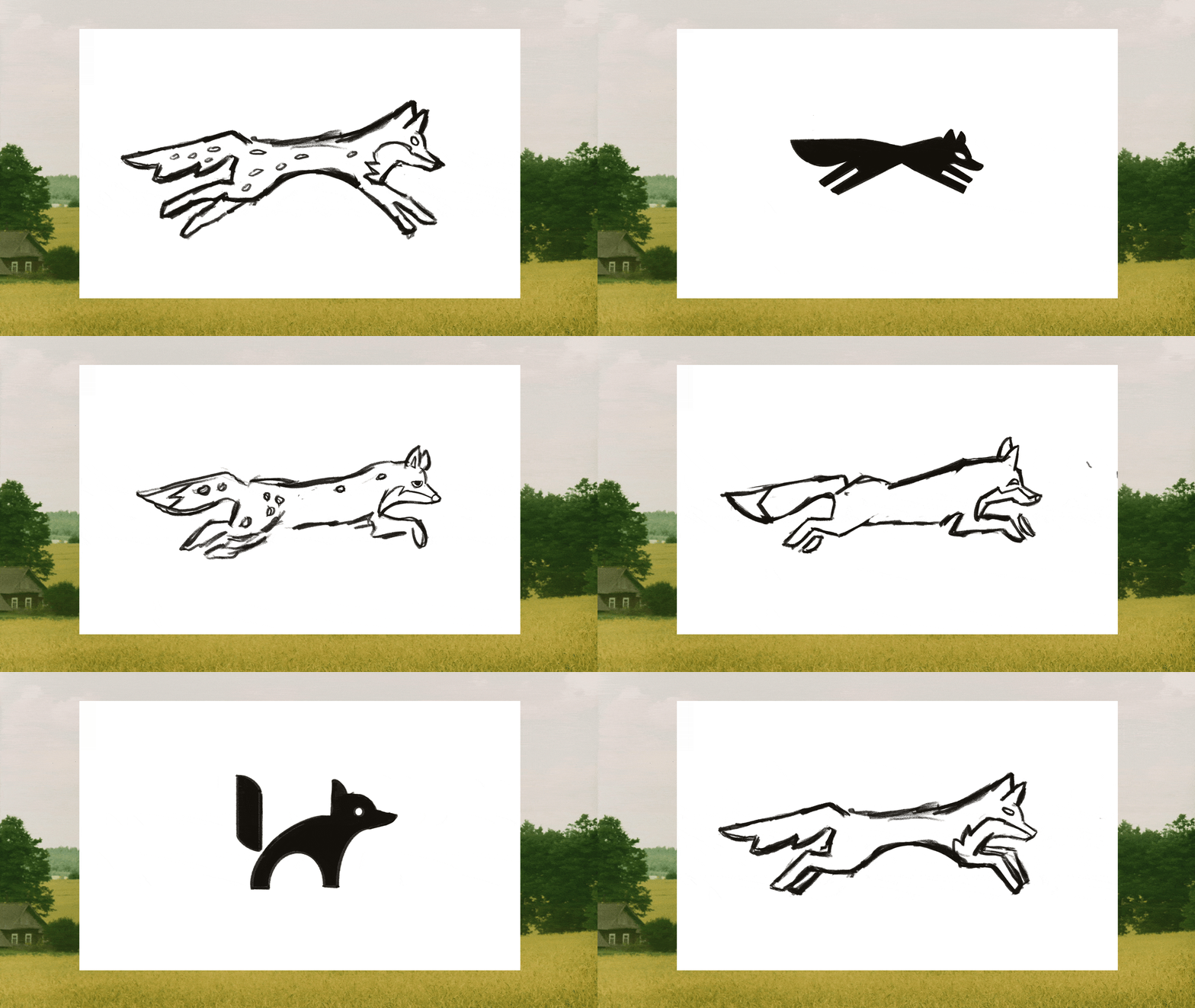
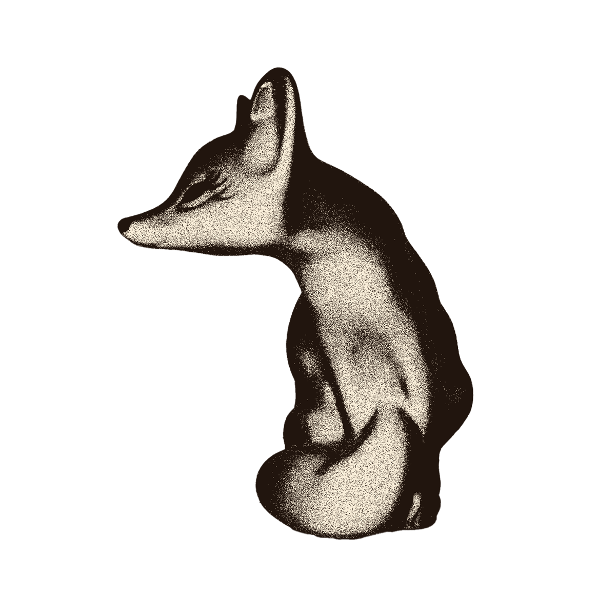
Moodboarding and wireframe sketching guided the visual direction and layout, while iterations of the fox logo simplified it into a scalable icon that retained its character across applications.